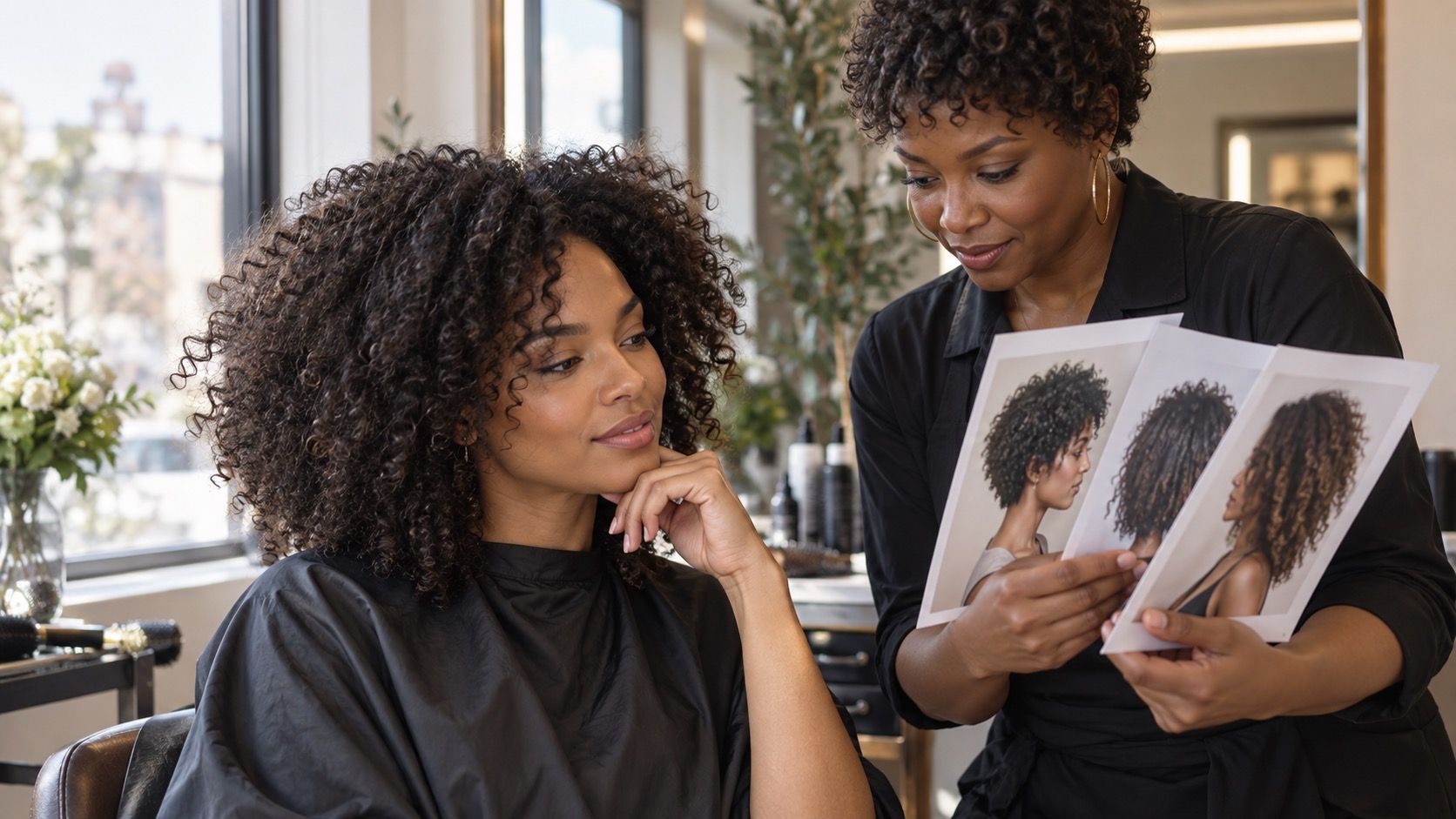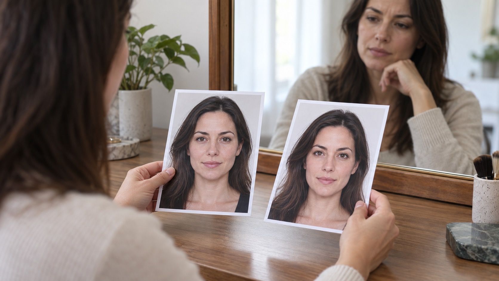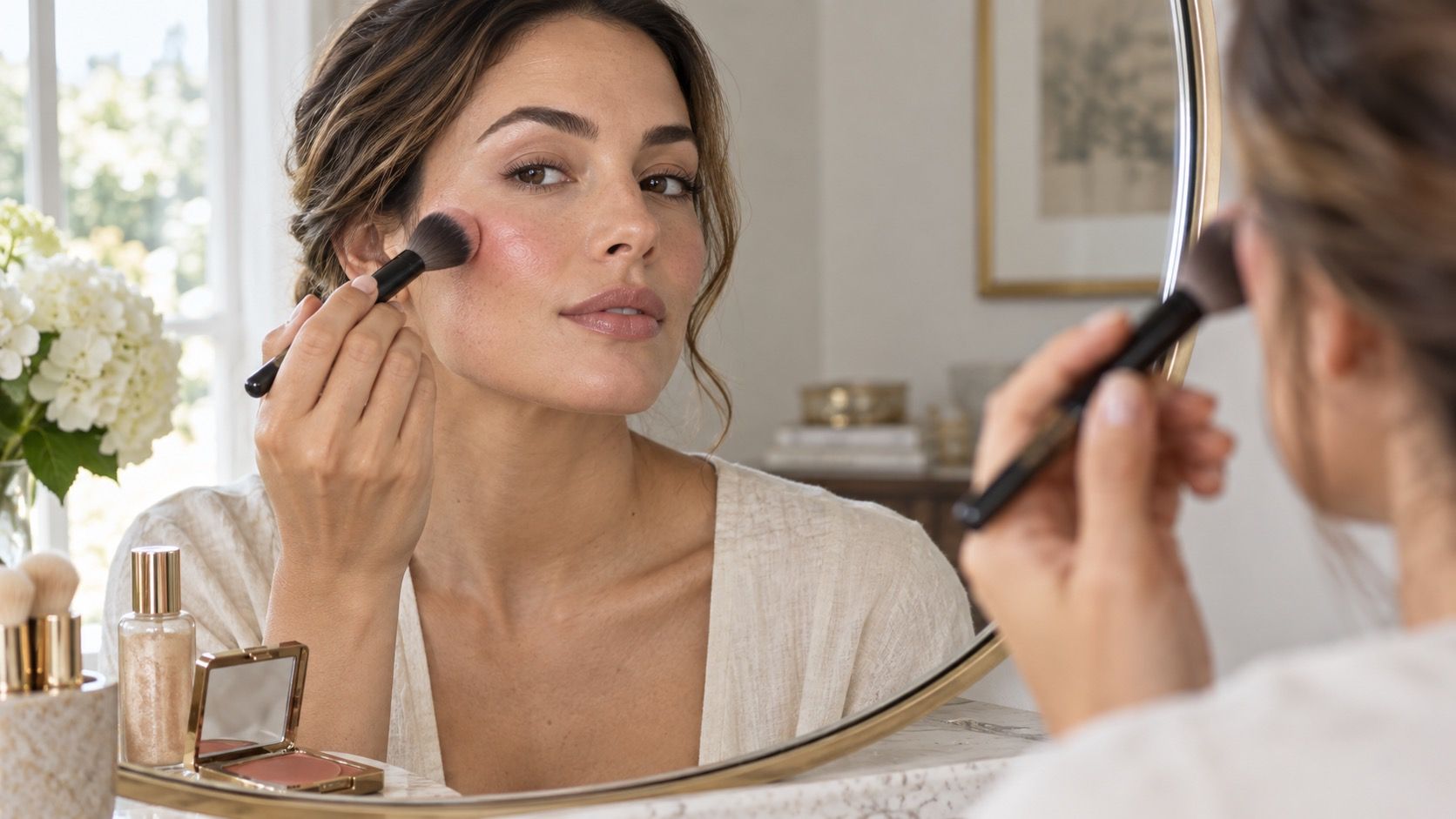
Makeup placement can shift the emphasis of a face, but it does not need to turn an oval face into a different category or make every feature look symmetrical. The useful question is simpler: where do you want color and light to sit when you look straight ahead in ordinary daylight? A few light layers of blush, contour, and highlight are easier to adjust than a copied diagram applied with a heavy hand.
Use placement as an option, not a correction
Face-shape advice often sounds more absolute than it is. A round face can have pronounced cheekbones, a long face can have a broad jaw, and two people with an oval outline can need completely different makeup because their eyes, nose, and hairline pull attention in different directions. Treat labels such as round, square, heart, or diamond as a starting map rather than an instruction to erase whatever makes your face yours.
Find your own high points before choosing a trend
Before applying color, look at your bare face from arm's length in a window or near a neutral lamp. Notice the places that already catch light: the top of the cheekbone, the bridge of the nose, the center of the chin, or the brow bone. Then notice where natural shadow falls beneath a cheekbone or along the temple. This is more useful than chasing a dramatic before-and-after photo taken under studio lights.
For makeup for face shape, choose one priority per look. You may want cheeks that appear a little more lifted, more width through the middle of a long face, or a softer transition near a square jaw. Trying to lift, narrow, shorten, sculpt, and brighten everything at once is when placement becomes muddy. Foundation should even the base; it should not hide the landmarks you need to see.
Smile gently, then relax your mouth. The fullest point of the cheek often moves between those two expressions, which explains why blush can look fine in the bathroom and strangely low once you are talking. Place a clean brush handle from the outer corner of the nose toward the top of the ear: the cheekbone usually runs near that line, but its exact height varies. Start product slightly above the fullest area rather than directly in the hollow below it.
A good test is to apply a tiny amount on one side only, step back, and turn your head left and right. If the color appears to sit on the front of the cheek in every angle, move it a few millimeters outward or upward. If it disappears entirely from the front view, bring the first touch of color inward. This small adjustment matters more than whether a face is officially heart-shaped or oblong.
Brush size changes the result. A large fluffy brush blurs placement and is forgiving with a sheer powder blush. A smaller angled brush gives more control with cream blush or contour, but it can create a stripe if the product is too opaque. Tap excess product on the back of your hand, build in thin layers, and check the edge near the nose before adding more. The cleanest placement still looks wrong when the first layer is too dense.
Place blush according to the effect you want
Blush placement face shape advice works best when it describes an effect rather than a rule. For a face that appears round or wide through the cheeks, begin near the outer half of the cheek and blend toward the temple. Keep the color softly above the hollow, not in a diagonal line from the mouth. This can give the eye an upward route without leaving the center of the face blank.
For a longer or rectangular face, carrying a little color horizontally across the cheek can make the mid-face feel more connected. Stop before the nose rather than sweeping a bright band all the way across. On a heart-shaped face, a soft rounded blush area just outside the apple can balance a wider forehead without making the lower face seem pointy. For a square face, a diffused oval of color over the cheek helps soften the transition to an angular jaw.
| What you notice | A gentle placement to try | What to avoid at first |
|---|---|---|
| Cheeks look very wide in photos | Start at the outer cheek and blend up toward the temple | A large bright circle centered on the apple |
| Face looks long through the middle | Blend softly outward from the cheek's center | A narrow, very high diagonal stripe |
| Forehead feels broader than the chin | Use a rounded wash slightly outside the apple | Pulling blush too far toward the hairline |
| Jawline looks angular | Keep the edge of blush rounded and diffused | A sharp contour-and-blush line below the cheek |
These are experiments, not prescriptions. If you like a sun-flushed look, placing blush over the bridge of the nose can be beautiful on any face shape; simply use less product than you think. If you wear glasses, check where the frame crosses your cheek. A blush placement that starts too high may disappear under a thick frame, while one that begins too low can compete with it.
Contour for face shape works best in small, quiet shadows
Contour is not bronzer. A contour shade should resemble a believable shadow, usually neutral or softly cool compared with the warmth of the skin, while bronzer suggests sun exposure. Mixing the two is common and not disastrous, but a warm orange stripe under the cheekbone will rarely create the subtle structure most people expect from contour for face shape.
Use the smallest amount under the cheekbone only if a shadow is already visible there. Blend upward into the cheek rather than dragging product downward toward the mouth. On a round face, a short shadow under the outer cheek can add definition; extending it to the lips tends to look theatrical. On a long face, avoid placing every shadow in a vertical direction. A little soft contour at the temples or under the chin may be enough, depending on what you want to emphasize.
For a square face, diffuse contour around the outer forehead and the corners of the jaw instead of drawing hard brackets along both sides. For a heart-shaped face, a touch around the temples can visually quiet a broad upper face, but it should fade into the hairline. A diamond-shaped face may benefit from less cheek contour than expected because the cheekbones are already the strongest feature. In each case, leave the center of the face clean enough that skin still looks like skin.
Highlight should follow light, not cover every high point
Highlighter is most convincing where light would naturally strike and where texture is smooth enough to reflect it. The top of the cheekbone, a small point above the outer brow, or a narrow touch at the center of the nose can be enough. Applying a strong reflective formula to every listed high point creates a metallic mask and can make pores, fine lines, and foundation texture more visible.
For wider cheeks, keep highlight slightly higher and farther out than blush, stopping before the temple becomes a broad shiny patch. For a long face, avoid an unbroken bright line from forehead to nose to chin if you do not want to emphasize length. A small highlight on the cheekbones and cupid's bow often gives a fresher effect. If your chin projects or your nose bridge is prominent, a satin formula or no highlight there may look more balanced than a bright liquid product.
Texture matters as much as placement. Pressed powder can be softened with a fluffy brush; balm and cream formulas look natural when tapped over a thin base. Apply cream products before setting powder where possible, and avoid rubbing them across already-set foundation. When in doubt, choose a satin sheen rather than visible glitter, then judge it at normal conversational distance.
Check the finished face in the light where you actually live
Bathroom lighting is often overhead, yellow, and unforgiving in a very specific way. It can make a well-blended cheek look invisible, encouraging you to add too much. Window light and a phone camera at eye level offer a more useful second opinion. Take a front-facing photo without flash, then a three-quarter photo; do not use a close selfie camera as the only test because its lens can enlarge the center of the face.
Look for three things: whether both cheeks have a similar visual weight, whether contour reads as shadow rather than a line, and whether highlight appears only when you move. Perfect face symmetry is not the goal. If one cheekbone sits higher, matching placement by millimeters can actually make the difference more noticeable. Match the overall effect instead.
Keep a clean brush or sponge nearby for the last correction. Lift excess blush at the lower edge, soften contour with a trace of foundation, or tap powder over a too-bright highlight. These small repairs are faster and kinder to the skin than removing a full base. After a few wears, you will have a personal map that works better than any universal diagram.